Broken Window Logo for London Olympics
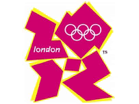 London Logo on being informed it had just earned £400,000.00
Despite having worked up in Town for many years and having enjoyed the galleries and museums and having a strong attachment to H.M.S. Belfast which was my first ship, I never intend to visit Londonistan ever again. Unless of course it is to help overthrow this corrupt Labour government and hang all the corrupt M.P.'s from the lamp posts of a reclaimed London.
Then I read about the London Olympics, which is nicely on track for wasting even more money then the discredited Dome. I am sure however that the "in-crowd" will all manage to pick the pockets of the British Taxpayers of the entire Country to pay for this future disaster and their new homes and cars.
Reading some of the garbage spoken by some of the Olympics few supporters, I broke down in fits of laughter at how pathetic these creatures are:
“When people see the new brand, we want them to be inspired to make a positive change in their life.”
“Not a logo but a state of mind, it’s an attitude”
Seb Coe told reporters that “We [London] doesn’t do bland” and that the logo has “got to live for the next 5 years.” Adding that it “..is the vision at the very heart of our brand”.
Crazy as fruit bats overdosing on their own egos.
Now a British National Party government would know what to do with the people who are ripping off British Taxpayers at the expense of our more vital services. The logo would not be laughing then. Check out what others have to say about this fractured logo that perhaps now represents our fractured nation. Cheers for that JoG but shouldn't you be working?
Tags:
![]()


6 comments:
That logo is the crappiest idea from a crap government yet, it shows the whole problem with the UK.
We have a government that ok's a logo with no coats of arms, no colours of the Union flag, no colours of any of the flags of the UK, no upper case L in London and says nothing about the nation hosting the games.
The Lisa Simpson blowing logo is far more apt for whats happening here in Britain.
Good God.
That well known supporter of Global Human Rights The CHINA DAILY has jumped into the debate on the logo.
http://www.chinadaily.com.cn/2008/2007-06/05/content_887412.htm
"Bob Neill, 2012 Olympics spokesman for the main opposition Conservative Party, was disparaging ... "Lord Coe has described this logo as 'ambitious, interactive and youth-friendly'. I would describe it as hideous," he said.
"Questions need be answered as to how we have ended up in this situation. Was there an open competition to supply the designs? If so, what on earth do the rejected ones look like!
Sorry I forgot to add one more thing. Take a look at the header on that China Daily website. Because the logo THEY have for the Peking games at the top of the page is actually quite pleasing to the eye.
One thing they forgot to add to the logo which would have made it much more representative of the present time . london ? surely they meant londonistan . For how many more years do we have to suffer these morons , chancers and crooks making a laughing stock out of decent people .
Here's a site with all the modern Olympic posters up to Sydney 2000 http://images.google.co.uk/imgres?imgurl=http://www.mapsofworld.com/olympic-trivia/images/olympic-posters/london1948.jpg&imgrefurl=http://www.mapsofworld.com/olympic-trivia/olympic-poster.html&h=400&w=400&sz=27&hl=en&start=6&um=1&tbnid=zBP0UgrJzH799M:&tbnh=124&tbnw=124&prev=/images%3Fq%3D1948%2BOlympic%2BLogo%26svnum%3D10%26um%3D1%26hl%3Den%26safe%3Doff%26sa%3DN
The London 2012 one will be the crapiest of the lot.
Here's what the logo really says.
http://www.youtube.com/watch?v=GaNH8XD2k1Y
Cheers,
Harry.
Post a Comment